top of page
a destructive
social impact
[ 2023 mar ]
layout design, typography
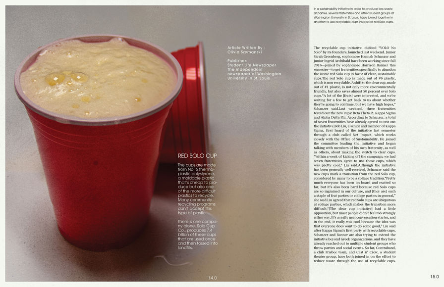
A magazine publication highlighting the sustainability problems that a social life in college brings.
The publication targets the college student population in talking about how to be more sustainable when going out at night. It features interviews by brothers at the social fraternities Phi Kappa Theta and Delta Sigma Phi discussing the aftermath of social events.


Process


The hardest part about the brutalist style is finding that sweet spot between nice design and words being thrown on a page. Making a clean grid and then breaking the grid with a bold heading was something that I kept throwing at the page. Some of it stuck, but most of the time did not.
A majority of inspiration came from brutalist design magazines. Until now I had only been exposed to "basic" magazines like Sports Illustrated and People. I wasn't aware of this simplistic design where typography speaks the most. I was (and still am) so drawn to it as a design style that I decided to use it for my magazine.

final
bottom of page


